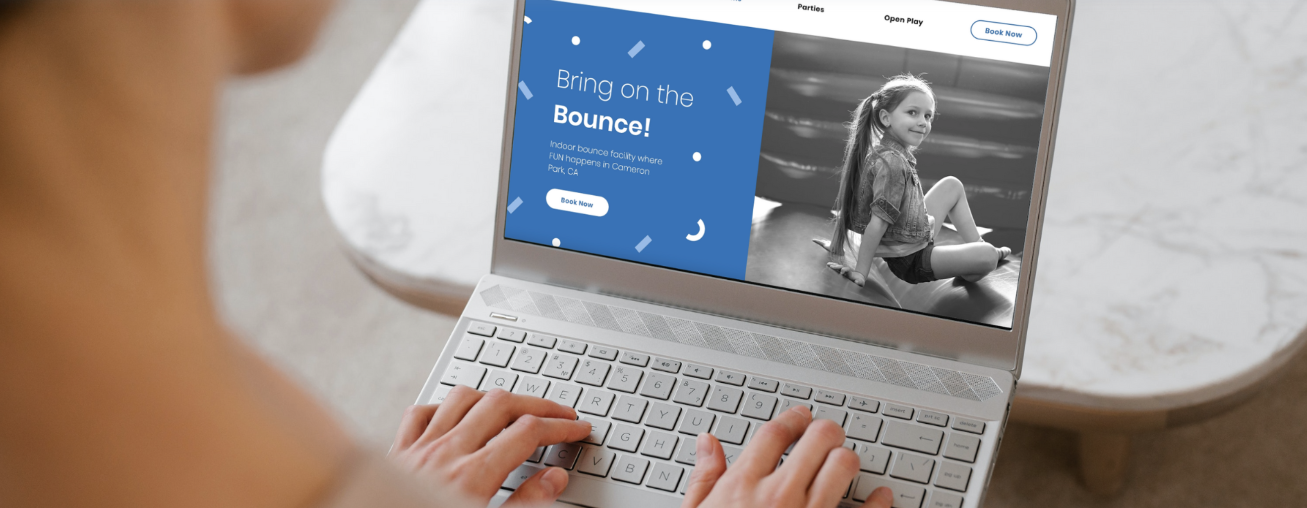
A great family entertainment center website is a powerful business asset. It can help you attract new customers, grow bookings, and so much more.
In this article, we’re going to discuss the key elements of a successful FEC website, what to consider, and so much more!
Do you currently have a website for your family entertainment center?
If so, is it easy to access your online booking or party package info from your home page?
Believe it or not, as FEC website designers, we come across lots of sites that do not have calls-to-action, great pictures, and even detailed package descriptions!
This is a huge missed opportunity. You can easily drive more traffic to your online booking page and grow bookings through a great website.
Attention spans are getting shorter.
Did you know that the average time spent on a website is only 15 seconds?
It’s likely that for most potential customers, your website is the first impression they will have of your facility. That's why it has become increasingly more important to grab viewer attention, fast!
However, this doesn’t mean you have to load your website with multiple colors, graphics, videos, and other elements.
Really, the key here is to make things simple for your website visitors. Oftentimes with web design, we think that the more stuff we add, the better. The opposite is true. What’s really important is whether your website addresses what the customer is looking for:
-
What attractions are available?
-
What’s the price?
-
Where do I book?
Hit all three and customers are sure to book a party through your website!
What makes a BAD FEC website?
Some elements of a bad FEC website are:
-
Poor branding, too many colors, website not matching logo, blurry logo
-
No calls-to-action directing to online booking page
-
Cluttered layout and lack of organization
-
Hidden navigation or confusing menu
What makes a GREAT FEC website?
Some elements of a great FEC website are:
-
Great branding and color scheme that is aesthetically pleasing, logo matches the color scheme
-
Logo is a high-quality image, not pixelated or blurry
-
Plenty of calls-to-action on each page like “Visit Now”, “Book Now”, or “Book a Party” linking to online booking page
-
Easy navigation menu
-
Links to social media
Party Center Software’s Top 3 Website Success Tips
As noted above, there are a lot of elements you can add to your website that’ll make it stand out and help you grow your business.
Here are our top 3 tips:
1. Great, high-quality photos of your facility.
Customers want to know what they’re in for when they visit your FEC.
What are the different attractions that you offer? Do other customers enjoy them?
Showcase photos of people having fun at your facility. If you can get the visitor to envision how much fun they’re going to have, you can successfully win them over.
Great photos (and videos) are the easiest way to make a great first impression. We highly recommend hiring a photographer to get high-quality photos for your website. Consider getting some friends to stop by with their kiddos and help you snap some great photos. The key here is to grab candid photos of people enjoying their time at your facility — this includes smiling faces, kids having fun, and more.
If you host certain events or do birthday parties, take pictures of these events or guests enjoying activities included in certain packages!
And if you’re worried about snapping pictures of guests or friends, include a release form in your waiver.
2. Calls-to-action = More bookings!
Calls to action are buttons or links throughout your website that push your customers to book a party, request a call, or do whatever you intend them to do.
Oftentimes, we do not see “Book Now” buttons on many FEC websites.
Put yourself in a visitor’s shoes. Maybe you tried booking a party for your child before. You want to know everything about the package right away and where to book. The harder you make this for your customers, the more frustrated they’ll become. Think of how many clicks you need to make in order to get to where you need to go!
Our recommendation is that you add plenty of calls to action on each page.
You might be thinking: Wait a minute, maybe that’s too much? Or maybe we should just have one to keep things simple?
We’re all about simplicity, but keep in mind that people’s attention spans are short. Once we click on a new page, we might not remember where the Book Now button went, unless it’s on the header of every page! It’s important to treat each page like a sales pitch. It might be a page that talks about parties, or facility rules, or attractions, but each topic still points to booking a party at your facility — so why not make sure you have a call to action present?
Remember: when you add the option for your customers to book right then and there as they’re browsing your site, the likelihood of them booking not only increases, but you’ll capture 30% MORE business than you would without this option! And this is just the average. We’ve watched FECs double their party revenue by adding the option to book online!
3. Make sure your site is mobile-friendly.
Making sure that your site is functional via smartphone will help you book more parties.
Every year, we release an online booking study that helps us understand current customer booking behavior, popular booking activities, and more. Our 2022 Online Booking Study revealed that online booking has far exceeded in-house booking.
Furthermore, mobile booking has FAR exceeded booking parties via desktop or laptop computers.
This means that creating a website that is functional via phone is more important now than ever. Making sure that the buttons and elements are positioned correctly, that the font is big enough, and that it loads properly is all critical. You’ll also want to check what the website looks like on different operating systems, such as Android or iOS.


